Arc
|

Sun Roof
|
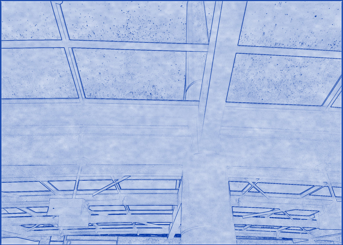
These were right across the street from each other. I liked both of these. The blueprint one looks like an old building. The pillars and designs make it look Greek. The second one was the one alley with all the stores.
Four Story
|
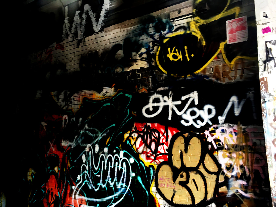
Street Art
|
These were also across the street from each other. The one on the right is in graffiti alley. I really like graffiti and how it looks. I like the colors and the over all style. I like the bubble letters and how things are written. I edited it to make the colors pop (I did that with all pictures that have graffiti or murals). For the blueprint I like it because it looks like a real blueprint.
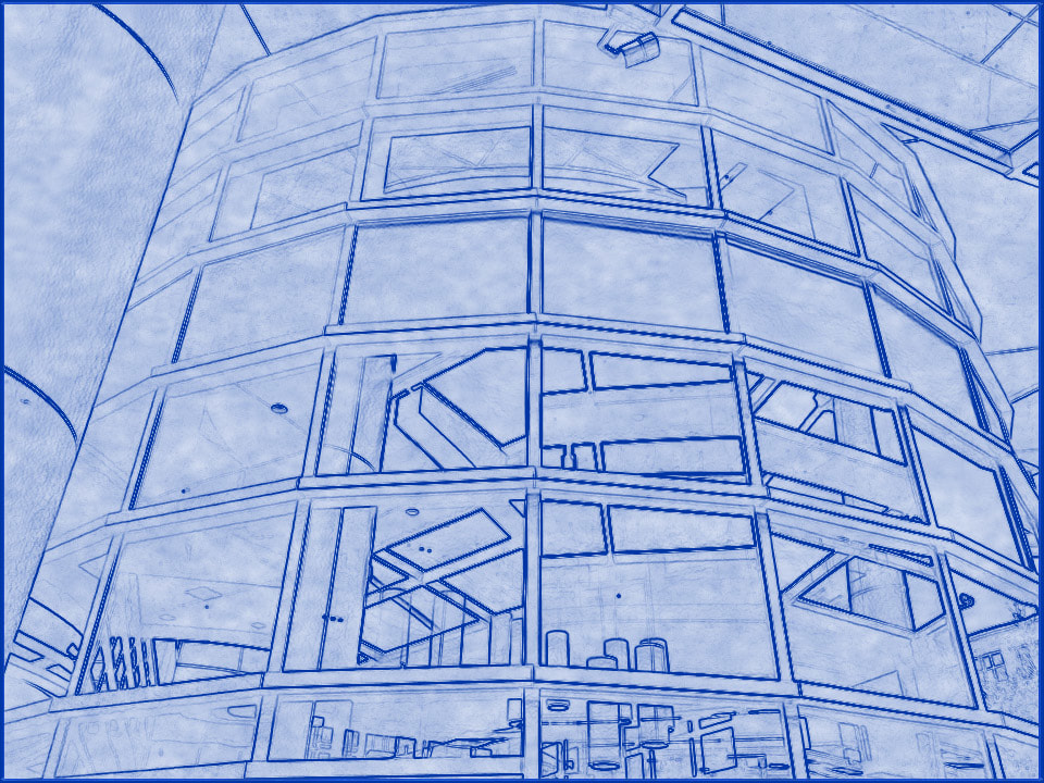
Cylinder
|
Mural
|
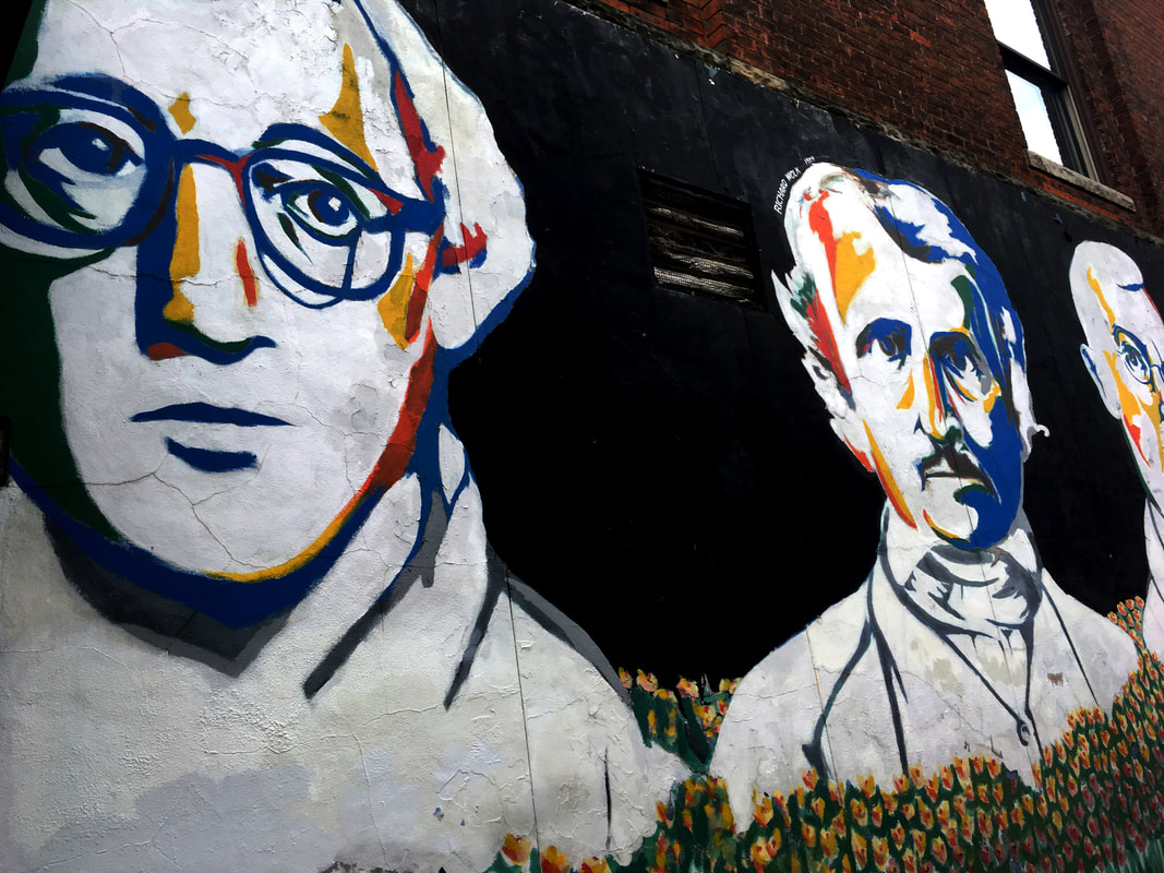
These weren't next to each other. The one on the left was some type of U of M building. The one on the right is the mural next to the starbucks and the theater and M Den. I edited the mural to make the colors pop. I like how the blue yellow and red came out.
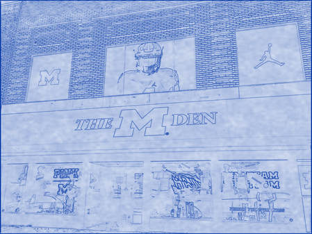
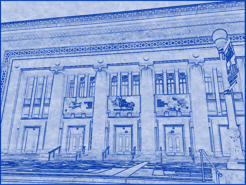
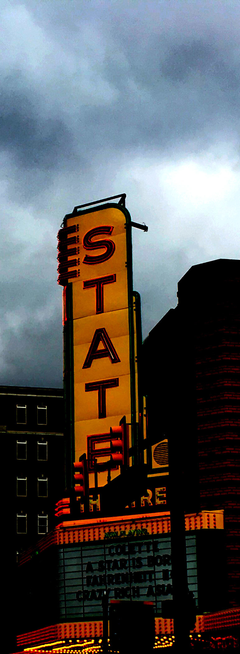
Team Spirit
|
These are in the same building. I took these while I was in my car at the traffic light. It made a nice street view. I like the state theater picture a lot. I've never watched a movie there. I have purchased clothes from the M den.
|
Theater
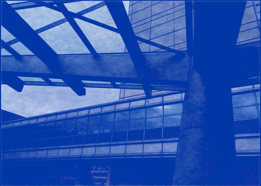
|
Window
|
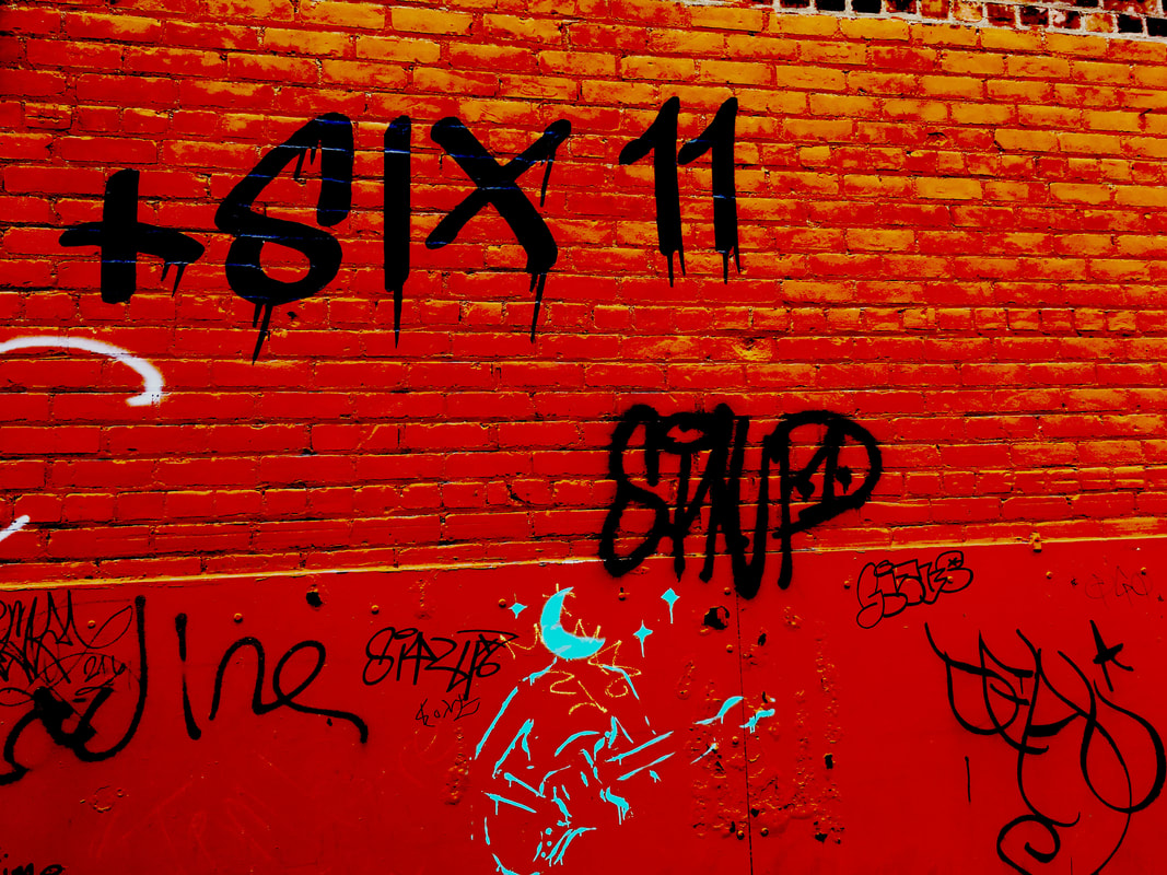
Tags
|
These weren't in the same building but around the same area/street. The glass one is similar to one of my other glass photos. The graffiti photo looks really nice because the little turqoise tag with the moon glows really nice. The other tags pop on the brick because the way I edited it.
Bridge
|
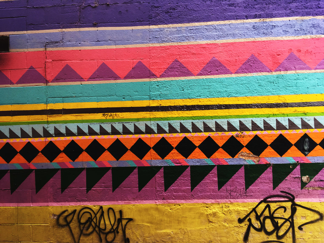
Geometric
|
This blueprint was the worst. It was at a U of M medical building. The mural is nice. I liked how it looked with peoples tags over it (I would be mad if I worked hard on a mural and someone tagged it). The black diamonds and triangles pop and so does the orange and pink. I like photographing graffiti and raising contrast and curves to make it bright.
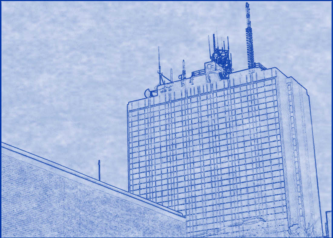
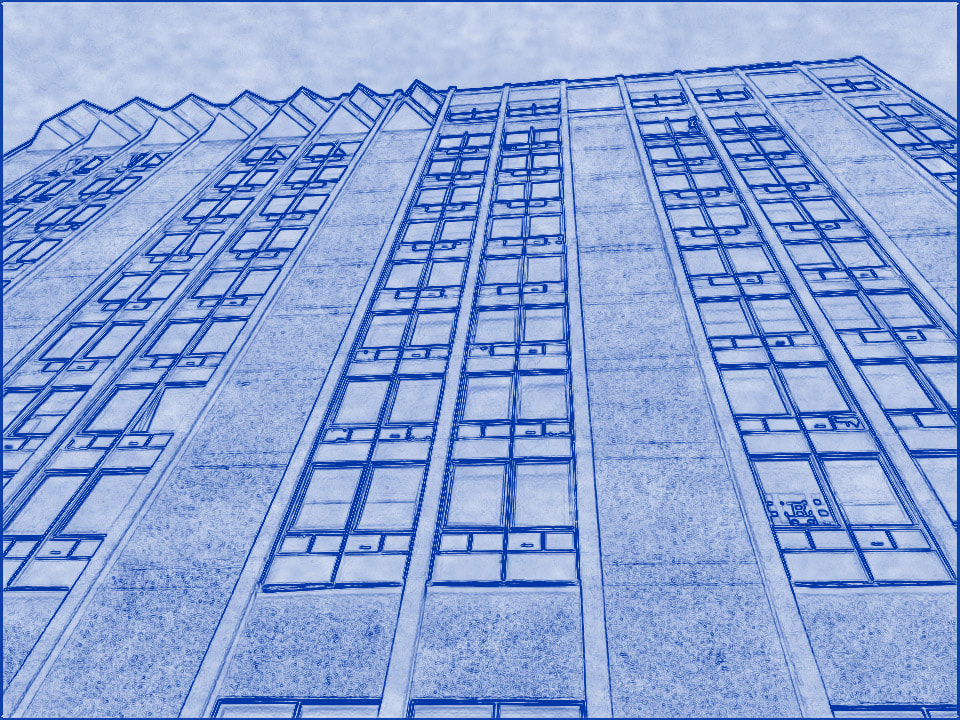
Tower
|
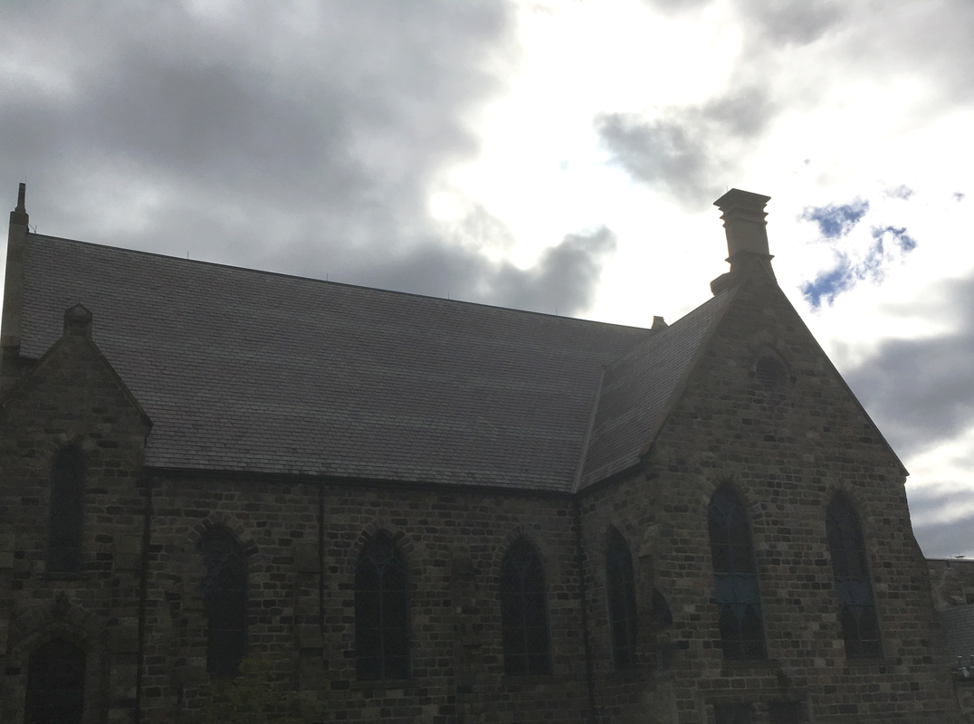
Old
|
The picture of the old building is my least favorite. I have nothing to say about either of these.
